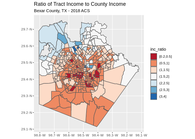
Bexar County Income Ratio
This example shows how to calculate an index of income segregation for Bexar County, TX using data from the 2018 American Community Survey
Some measures of economic segregation are calculated by the Census bureau directly, in the American Community Survey, the Census provides the Gini Index of income inequality for many geographies. This measure is widely used in economics and give a general picture of the equality of the income distribution within a place, although it says nothing about how the different income groups live with respect to one another.
A second measure of income segregation is very simple to calculate, although it is frequently criticized as being arbitrary. It is the ratio of the median household income in each subarea to the median household income in the larger area. It is also easy to interpret. If a subarea has a lower income than the larger area, the index will be less than one, and if a subarea has a higher income, the index is greater than one.
You can find maps of this index for many US metro areas through the Brown University Diversity and Disparities project, which provides maps of this ratio.
Below, I show how this can be easily calculated in R, and this can easily be modified for a different county of interest.
The next example will be to calculate the income ratio index which we described above, while not ideal, this should provide a simple visualization of income inequality within places.
First, we query the median household incomes in Bexar Census tracts, then the income for Bexar county as a whole, and form the ratio.
## Getting data from the 2014-2018 5-year ACS## Downloading feature geometry from the Census website. To cache shapefiles for use in future sessions, set `options(tigris_use_cache = TRUE)`.## Warning: `funs()` is deprecated as of dplyr 0.8.0.
## Please use a list of either functions or lambdas:
##
## # Simple named list:
## list(mean = mean, median = median)
##
## # Auto named with `tibble::lst()`:
## tibble::lst(mean, median)
##
## # Using lambdas
## list(~ mean(., trim = .2), ~ median(., na.rm = TRUE))
## This warning is displayed once every 8 hours.
## Call `lifecycle::last_warnings()` to see where this warning was generated.bex_tract<-bex_tract%>%
mutate(med_inc_tr=B19013_001E, cofips=substr(GEOID, 1,5))
pa_counties<-get_acs(geography="county", state = "TX",output="wide", year=2018,variables = "B19013_001E")## Getting data from the 2014-2018 5-year ACSbex_county<-pa_counties%>%
filter(GEOID=="48029")%>%
mutate(med_inc_co=B19013_001E)%>%
select(GEOID, med_inc_co)
bexar_merge<-geo_join(bex_tract, bex_county, by_sp="cofips", by_df="GEOID")## Warning: `group_by_()` is deprecated as of dplyr 0.7.0.
## Please use `group_by()` instead.
## See vignette('programming') for more help
## This warning is displayed once every 8 hours.
## Call `lifecycle::last_warnings()` to see where this warning was generated.Now we create a map of the ratio in the tracts within Bexar County. we see that the west and east sides of the city have incomes lower than the county, while the north side, and especially the area of Shavano park have higher incomes that the county as a whole.
bexar_merge%>%
  filter(is.na(inc_ratio)==F)%>%
  mutate(inc_ratio = cut(inc_ratio, breaks = c(.2, .5, 1, 1.5, 2, 2.5, 3, 4) , include.lowest = T))%>%
  ggplot()+geom_sf(aes(fill=inc_ratio))+
  scale_fill_brewer(palette = "RdBu")+
  scale_color_brewer(palette = "RdBu")+
  ggtitle("Ratio of Tract Income to County Income", subtitle = "Bexar County, TX - 2018 ACS")