Spatial GLMM(s) using the INLA Approximation
The INLA Approach to Bayesian models
The Integrated Nested Laplace Approximation, or INLA, approach is a recently developed, computationally simpler method for fitting Bayesian models [(Rue et al., 2009, compared to traditional Markov Chain Monte Carlo (MCMC) approaches. INLA fits models that are classified as latent Gaussian models, which are applicable in many settings (Martino & Rue, 2010. In general, INLA fits a general form of additive models such as:
\(\eta = \alpha + \sum_{j=1}^{nf} f^{(j)}(u_{ij}) + \sum_{k=1}^{n\beta}\beta_k z_{ki} + \epsilon_i\)
where \(\eta\) is the linear predictor for a generalized linear model formula, and is composed of a linear function of some variables u, \(\beta\) are the effects of covariates, z, and \(\epsilon\) is an unstructured residual (Rue et al., 2009). As this model is often parameterized as a Bayesian one, we are interested in the posterior marginal distributions of all the model parameters. Rue and Martino (2007) show that the posterior marginal for the random effects (x) in such models can be approximated as:
\(\tilde{p}(x_i|y) = \sum_k \tilde{p}(x_i|\theta_k, y) \tilde{p}(\theta_k|y) \Delta_k\)
via numerical integration (Rue & Martino, 2007; Schrodle & Held, 2011a, 2011b). The posterior distribution of the hyperparameters (\(\theta\)) of the model can also be approximated as:
\(\tilde{p}(\theta | y)) \propto \frac{p(x, \theta, y)}{\tilde{p}G(x| \theta,y)} \mid _{x} = x^*(\theta)\)
, where G is a Gaussian approximation of the posterior and \(x^*(\theta)\) is the mode of the conditional distribution of \(p(x|\theta,y)\). Thus, instead of using MCMC to find an iterative, sampling-based estimate of the posterior, it is arrived at numerically. This method of fitting the spatial models specified above has been presented by numerous authors (Blangiardo & Cameletti, 2015; Blangiardo et al., 2013; Lindgren & Rue, 2015; Martins et al., 2013; Schrodle & Held, 2011a, 2011b), with comparable results to MCMC.
Libraries
Data
I have the data on my github site under the nhgis_vs page. These are data from the NHGIS project by IPUMS who started providing birth and death data from the US Vital statistics program.
The data we will use here are infant mortality rates in US counties between 2000 and 2007.
files<-list.files("~/ExpanDrive/Google Drive/classes/dem7473/data/nhgis0022_csv/nhgis0022_csv/", pattern = "*.csv", full.names = T)
vital<-lapply(files, read.csv, header=T)


library(plyr)
df <- ldply(vital, data.frame)
df$cofips<-paste(substr(df$GISJOIN, 2,3), substr(df$GISJOIN, 5,7), sep="")

df<-df%>%
  filter(YEAR %in%2000:2007)%>%
  mutate(rate=as.numeric(AGWJ001) )%>%
  select(YEAR, cofips,rate)
head(df)
## YEAR cofips rate
## 1 2000 01001 34
## 2 2000 01003 61
## 3 2000 01005 125
## 4 2000 01007 70
## 5 2000 01009 89
## 6 2000 01011 242Census intercensus population estimates
From the Census population estimates program
popurl<-url("http://www2.census.gov/programs-surveys/popest/datasets/2000-2010/intercensal/county/co-est00int-tot.csv")
pops<-read.csv(popurl)
names(pops)<-tolower(names(pops))
pops<-pops%>%
  mutate(cofips = paste(sprintf(fmt = "%02d", state), sprintf(fmt = "%03d",county), sep=""))%>%
  filter(sumlev==50, !state%in%c(2, 15))

head(pops)
## sumlev region division state county stname ctyname estimatesbase2000
## 1 50 3 6 1 1 Alabama Autauga County 43751
## 2 50 3 6 1 3 Alabama Baldwin County 140416
## 3 50 3 6 1 5 Alabama Barbour County 29042
## 4 50 3 6 1 7 Alabama Bibb County 19856
## 5 50 3 6 1 9 Alabama Blount County 50982
## 6 50 3 6 1 11 Alabama Bullock County 11603
## popestimate2000 popestimate2001 popestimate2002 popestimate2003
## 1 44021 44889 45909 46800
## 2 141342 144875 147957 151509
## 3 29015 28863 28653 28594
## 4 19913 21028 21199 21399
## 5 51107 51845 52551 53457
## 6 11581 11358 11256 11316
## popestimate2004 popestimate2005 popestimate2006 popestimate2007
## 1 48366 49676 51328 52405
## 2 156266 162183 168121 172404
## 3 28287 28027 27861 27757
## 4 21721 22042 22099 22438
## 5 54124 54624 55485 56240
## 6 11056 11011 10776 11011
## popestimate2008 popestimate2009 census2010pop popestimate2010 cofips
## 1 53277 54135 54571 54632 01001
## 2 175827 179406 182265 183195 01003
## 3 27808 27657 27457 27411 01005
## 4 22705 22941 22915 22867 01007
## 5 57055 57341 57322 57338 01009
## 6 10953 10987 10914 10890 01011Data prep
pops.long<-reshape(data = pops, idvar = "cofips", varying = list(names(pops)[9:16]), direction="long", drop = names(pops)[c(2,3,4,5,6,8,17,18,19,20)], v.names = "population")
pops.long$year<-pops.long$time+1999
head(pops.long)
## sumlev ctyname cofips time population year
## 01001.1 50 Autauga County 01001 1 44021 2000
## 01003.1 50 Baldwin County 01003 1 141342 2000
## 01005.1 50 Barbour County 01005 1 29015 2000
## 01007.1 50 Bibb County 01007 1 19913 2000
## 01009.1 50 Blount County 01009 1 51107 2000
## 01011.1 50 Bullock County 01011 1 11581 2000## cofips year sumlev ctyname time population rate
## 1 01001 2000 50 Autauga County 1 44021 34
## 2 01001 2001 50 Autauga County 2 44889 78
## 3 01001 2002 50 Autauga County 3 45909 83
## 4 01001 2003 50 Autauga County 4 46800 79
## 5 01001 2004 50 Autauga County 5 48366 76
## 6 01001 2005 50 Autauga County 6 49676 124Get census data using tidycensus
Here I get data from the 2000 decennial census summary file 3
#v00<-load_variables(year=2000, dataset = "sf3", cache = T)
cov_dat<-get_decennial(geography = "county", year = 2000, sumfile = "sf3",
                       summary_var = "P001001",
                       variables = c("P007003", "P007004","P007010","P053001", "P089001", "P089002" ),
                      output = "wide")
## Getting data from the 2000 decennial Censuscov_dat<-cov_dat%>%
mutate(cofips=GEOID,pwhite=P007003/summary_value, pblack=P007004/summary_value, phisp=P007010/summary_value,medhhinc=as.numeric(scale(P053001)), ppov=P089002/P089001)
final.dat<-merge(dat.long, cov_dat, by="cofips")
head(final.dat)## cofips year sumlev ctyname time population rate GEOID NAME
## 1 01001 2006 50 Autauga County 7 51328 93 01001 Autauga County
## 2 01001 2003 50 Autauga County 4 46800 79 01001 Autauga County
## 3 01001 2004 50 Autauga County 5 48366 76 01001 Autauga County
## 4 01001 2005 50 Autauga County 6 49676 124 01001 Autauga County
## 5 01001 2000 50 Autauga County 1 44021 34 01001 Autauga County
## 6 01001 2007 50 Autauga County 8 52405 83 01001 Autauga County
## P007003 P007004 P007010 P053001 P089001 P089002 summary_value pwhite
## 1 34760 7450 394 42013 43377 4738 43671 0.7959515
## 2 34760 7450 394 42013 43377 4738 43671 0.7959515
## 3 34760 7450 394 42013 43377 4738 43671 0.7959515
## 4 34760 7450 394 42013 43377 4738 43671 0.7959515
## 5 34760 7450 394 42013 43377 4738 43671 0.7959515
## 6 34760 7450 394 42013 43377 4738 43671 0.7959515
## pblack phisp medhhinc ppov
## 1 0.1705938 0.009022005 0.7593459 0.1092284
## 2 0.1705938 0.009022005 0.7593459 0.1092284
## 3 0.1705938 0.009022005 0.7593459 0.1092284
## 4 0.1705938 0.009022005 0.7593459 0.1092284
## 5 0.1705938 0.009022005 0.7593459 0.1092284
## 6 0.1705938 0.009022005 0.7593459 0.1092284Create expected numbers of cases
In count data models, and spatial epidemiology, we have to express the raw counts of events relative to some expected value, or population offset, see this Rpub for a reminder.
#ratesyr<-aggregate(rate~year, final.dat,mean) #in this case, we will standardize to the average IMR for the period
#ratesyr$E<-ratesyr$rate
#final.dat<-merge(final.dat, ratesyr[,-2], by="year")
#rates<-aggregate(rate~1, final.dat, mean)
final.dat$E_d<-mean(final.dat$rate)

final.dat<-final.dat[order(final.dat$cofips, final.dat$year),]
final.dat$id<-1:dim(final.dat)[1]

head(final.dat)
## cofips year sumlev ctyname time population rate GEOID NAME
## 5 01001 2000 50 Autauga County 1 44021 34 01001 Autauga County
## 8 01001 2001 50 Autauga County 2 44889 78 01001 Autauga County
## 7 01001 2002 50 Autauga County 3 45909 83 01001 Autauga County
## 2 01001 2003 50 Autauga County 4 46800 79 01001 Autauga County
## 3 01001 2004 50 Autauga County 5 48366 76 01001 Autauga County
## 4 01001 2005 50 Autauga County 6 49676 124 01001 Autauga County
## P007003 P007004 P007010 P053001 P089001 P089002 summary_value pwhite
## 5 34760 7450 394 42013 43377 4738 43671 0.7959515
## 8 34760 7450 394 42013 43377 4738 43671 0.7959515
## 7 34760 7450 394 42013 43377 4738 43671 0.7959515
## 2 34760 7450 394 42013 43377 4738 43671 0.7959515
## 3 34760 7450 394 42013 43377 4738 43671 0.7959515
## 4 34760 7450 394 42013 43377 4738 43671 0.7959515
## pblack phisp medhhinc ppov E_d id
## 5 0.1705938 0.009022005 0.7593459 0.1092284 72.33683 1
## 8 0.1705938 0.009022005 0.7593459 0.1092284 72.33683 2
## 7 0.1705938 0.009022005 0.7593459 0.1092284 72.33683 3
## 2 0.1705938 0.009022005 0.7593459 0.1092284 72.33683 4
## 3 0.1705938 0.009022005 0.7593459 0.1092284 72.33683 5
## 4 0.1705938 0.009022005 0.7593459 0.1092284 72.33683 6Next we make the spatial information, we get the polygons from census directly using counties from the tigris package. We drop counties not in the contiguous 48 US states.
Construction of spatial relationships:
Contiguity based neighbors
In a general sense, we can think of a square grid. Cells that share common elements of their geometry are said to be “neighbors”. There are several ways to describe these patterns, and for polygons, we generally use the rules of the chess board.
Rook adjacency Neighbors must share a line segment
Queen adjacency Neighbors must share a vertex or a line segment
If polygons share these boundaries (based on the specific definition: rook or queen), they are said to be “spatial neighbors” of one another. The figure below illustrates this principle.
For an observation of interest, the pink area, the Rood adjacent areas are those in green in the figure, because they share a line segment. For the second part of the figure on the right, the pink area has different sets of neighbors, compared to the Rook rule neighbors, because the area also shares vertices with other polygons, making them Queen neighbors.

Adjacency using Chessboard Rules
Order of adjacency
The figure above also highlights the order of adjacency among observations. By order of adjacency, we simply men that observations are either immediate neighbors (the green areas), or they are neighbors of immediate neighbors. These are referred to as first and second order neighbors.
So, we can see, that the yellow polygons are the neighboring areas for this tract, which allows us to think about what the spatial structure of the area surrounding this part of campus.
For an example, let’s consider the case of San Antonio again. If our data are polygons, then there is a function in the spdep library in R, poly2nb that will take a polygon layer and find the neighbors of all areas using either a queen or rook rule. First we form the neighbors using the rook rule for all the tracts in Bexar County.
Distance based association
The queen and rook rules are useful for polygon features, but distance based contiguity is useful for all feature types (points, polygons, lines). The idea is similar to the polygon adjacency rule from above, but the distance rule is based on the calculated distance between areas. There are a variety of distance metrics that are used in statistics, but the most commonly assumed one is the Euclidean distance. The Euclidean distance between any two points is:
\[D^2 = \sqrt{\left (x_1 - x_2 \right)^2 + \left (y_1 - y_2 \right)^2 } \] Where x and y are the coordinates of each of the two areas. For polygons, these coordinates are typically the centroid of the polygon (you may have noticed this above when we were plotting the neighbor lists), while for point features, these are the two dimensional geometry of the feature. The collection of these distances between all features forms what is known as the distance matrix between observations. This summarizes all distances between all features in the data.
K nearest neighbors
A useful way to use distances is to construct a k-nearest neighbors set.
This will find the “k” closest observations for each observation, where k is some integer.
For instance if we find the k=3 nearest neighbors, then each observation will have 3 neighbors, which are the closest observations to it, regardless of the distance between them which is important.
Using the k nearest neighbor rule, two observations could potentially be very far apart and still be considered neighbors.
#In INLA, we don't need FIPS codes, we need a simple numeric index for our counties
us_co$struct<-1:dim(us_co)[1]
nbs<-knearneigh(coordinates(as_Spatial(us_co) ), k = 5, longlat = T) #k=5 nearest neighbors
nbs<-knn2nb(nbs, row.names = us_co$struct, sym = T) #force symmetry!!
mat <- nb2mat(nbs, style="B",zero.policy=TRUE)
colnames(mat) <- rownames(mat)
mat <- as.matrix(mat[1:dim(mat)[1], 1:dim(mat)[1]])


nb2INLA("cl_graph",nbs)
am_adj <-paste(getwd(),"/cl_graph",sep="")
H<-inla.read.graph(filename="cl_graph")
#image(inla.graph2matrix(H), xlab="", ylab="", main="")
Plot geographies
library(sf)
us_co<-st_as_sf(us_co)
us_co$cofips<-paste(us_co$STATEFP, us_co$COUNTYFP, sep="")
us_co%>%
  ggplot()+geom_sf()+coord_sf(crs =7603)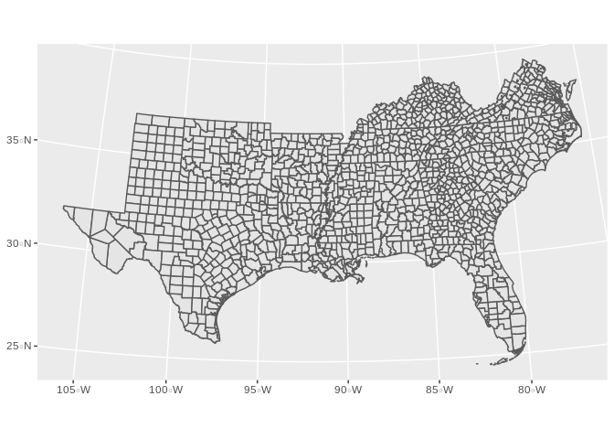
final.dat<-merge( us_co,final.dat, by="cofips", all.y=F)
final.dat<-final.dat[order(final.dat$cofips, final.dat$year),]
final.dat%>%
  filter(year==2000)%>%
  ggplot()+geom_sf(aes(fill=rate, col=rate))+coord_sf(crs =7603)+ggtitle("Infant Mortality Rate - 2000")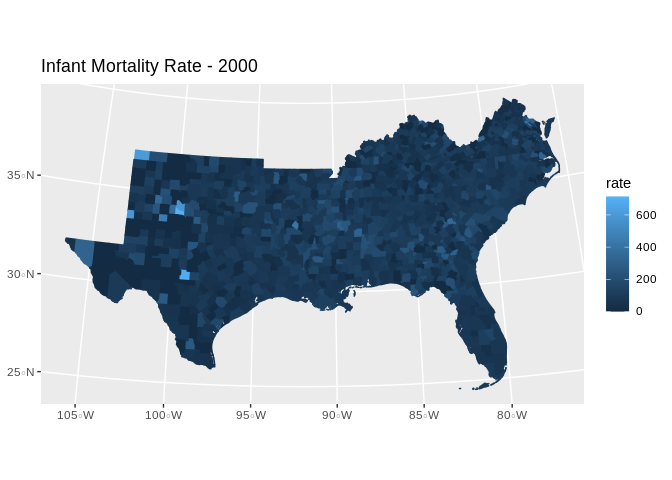
Model setup
- We have a count outcome (deaths and births), in counties over time, and a set of time-constant covariates.
We have several options in the GLM framework with which to model these data, for example:
Binomial - \[y_{ij} \sim Bin(\pi_{ij}) \text{: } logit(\pi_{ij} ) = \beta_{0}+ x'\beta_k \]
Poisson - \[y_{ij} \sim Pois(\lambda_{ij} E_{ij}) \text{: } log(\lambda_{ij} ) = log(E_{ij}) + \beta_{0}+ x'\beta_k \]
Negative Binomial - \[y_{ij} \sim \text{Neg Bin} (\mu_{ij}, \alpha, E_{ij}) \text{: } log(\mu_{ij} ) = log(E_{ij}) + \beta_{0}+ x'\beta_k \]
In addition to various zero-inflated versions of these data.
ggplot(data = final.dat)+geom_histogram(aes(x =log(rate) , y=0.5*..density..))+facet_wrap(~year)+
  ggtitle(label = "Distribution of Infant Mortality Rate by Year", subtitle = "US Counties, 2000-2007")
## `stat_bin()` using `bins = 30`. Pick better value with `binwidth`.## Warning: Removed 1849 rows containing non-finite values (stat_bin).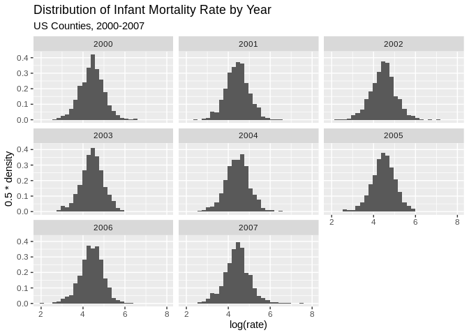
ggplot(data = final.dat)+geom_histogram(aes(x =log(rate/E_d) , y=0.5*..density..))+facet_wrap(~year)+
  ggtitle(label = "Distribution of Infant Mortality Relative Risk by Year", subtitle = "US Counties, 2000-2007")
## `stat_bin()` using `bins = 30`. Pick better value with `binwidth`.## Warning: Removed 1849 rows containing non-finite values (stat_bin).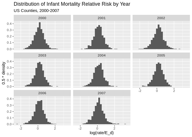
final.dat%>%
  dplyr::group_by(cofips)%>%
  dplyr::summarise(meanrate=mean(rate), meanE=mean(E_d))%>%
  dplyr::mutate(rate_e=meanrate/meanE)%>%
  #ungroup()
  # filter(year%in%c(2000))%>%
  # mutate(rate_e=rate/E_d)%>%
   mutate(qrr=cut(rate_e, breaks = quantile(rate_e, p=seq(0,1,length.out = 7)), include.lowest = T))%>%
  ggplot()+
  geom_sf(aes(fill=qrr))+
  scale_fill_brewer(type="seq", palette = "RdBu")+
  ggtitle(label="Relative Risk Quartile - period average 2000 to 2007")+
  coord_sf(crs = 7603)
## `summarise()` ungrouping output (override with `.groups` argument)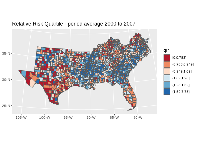
We can fit these model using the Bayesian framework with INLA.
First, we consider the basic GLM for the mortality outcome, with out any hierarchical structure. We can write this model as a Negative Binomial model, for instance as:
\[\text{Deaths}_{ij} \sim NB(\mu_{ij}, \gamma)\] \[\mu_{ij} = \text{log(E_d)}_{ij} + X' \beta\]
INLA will use vague Normal priors for the \(\beta\)’s, and we have other parameters in the model to specify priors for. INLA does not require you to specify all priors, as all parameters have a default prior specification. In this example, I will use a \(Gamma(1, .5)\) prior for all hierarchical variance terms.
#Model specification:
f1<-rate~scale(pblack)+scale(phisp)+scale(ppov)+year

#Model fit
mod1<-inla(formula = f1,data = final.dat, #linear predictor - fixed effects
           family = "nbinomial", E = E_d,  #marginal distribution for the outcome, expected count
           control.compute = list(waic=T), # compute DIC or not?
           control.predictor = list(link=1), #estimate predicted values & their marginals or not?
           num.threads = 2,
               verbose = F)
#model summary
summary(mod1)
##
## Call:
## c("inla(formula = f1, family = \"nbinomial\", data = final.dat, E =
## E_d, ", " verbose = F, control.compute = list(waic = T),
## control.predictor = list(link = 1), ", " num.threads = 2)")
## Time used:
## Pre = 0.928, Running = 21.8, Post = 0.722, Total = 23.5
## Fixed effects:
## mean sd 0.025quant 0.5quant 0.975quant mode kld
## (Intercept) -5.047 10.723 -26.102 -5.048 15.989 -5.047 0
## scale(pblack) 0.159 0.015 0.130 0.159 0.188 0.159 0
## scale(phisp) -0.025 0.013 -0.050 -0.025 0.001 -0.025 0
## scale(ppov) 0.041 0.015 0.012 0.041 0.070 0.041 0
## year 0.003 0.005 -0.008 0.003 0.013 0.003 0
##
## Model hyperparameters:
## mean sd 0.025quant
## size for the nbinomial observations (1/overdispersion) 0.624 0.009 0.608
## 0.5quant 0.975quant
## size for the nbinomial observations (1/overdispersion) 0.624 0.641
## mode
## size for the nbinomial observations (1/overdispersion) 0.624
##
## Expected number of effective parameters(stdev): 5.04(0.001)
## Number of equivalent replicates : 2124.92
##
## Watanabe-Akaike information criterion (WAIC) ...: 114586.38
## Effective number of parameters .................: 10.27
##
## Marginal log-Likelihood: -57331.80
## Posterior marginals for the linear predictor and
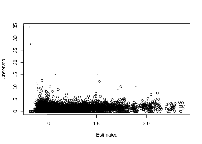
## the fitted values are computedPlot our observed vs fitted values
Basic county level random intercept model
Now we add basic nesting of rates within counties, with a random intercept term for each county. This would allow there to be heterogeneity in the mortality rate for each county, over and above each county’s observed characteristics.
This model would be:
\[\text{Deaths}_{ij} \sim NB(\mu_{ij}, \gamma)\] \[\mu_{ij} = \text{log(E_d)}_{ij} + X' \beta + u_j\] \[u_j \sim \text{Normal} (0 , \tau_u)\]
where \(\tau_u\) here is the precision, not the variance and precision = 1/variance. INLA puts a log-gamma prior on the the precision by default.
f2<-rate~scale(pblack)+scale(phisp)+scale(ppov)+year+ #fixed effects
  f(struct, model = "iid",param=c(1,.5))  #random effects

mod2<-inla(formula = f2,data = final.dat,
           family = "nbinomial", E = E_d,
           control.compute = list(waic=T),
           control.predictor = list(link=1),
           num.threads = 2,
               verbose = F)

#total model summary
summary(mod2)
##
## Call:
## c("inla(formula = f2, family = \"nbinomial\", data = final.dat, E =
## E_d, ", " verbose = F, control.compute = list(waic = T),
## control.predictor = list(link = 1), ", " num.threads = 2)")
## Time used:
## Pre = 0.571, Running = 160, Post = 1.36, Total = 162
## Fixed effects:
## mean sd 0.025quant 0.5quant 0.975quant mode kld
## (Intercept) -2.824 10.758 -23.945 -2.824 18.279 -2.824 0
## scale(pblack) 0.158 0.015 0.128 0.158 0.189 0.158 0
## scale(phisp) -0.041 0.014 -0.069 -0.041 -0.013 -0.041 0
## scale(ppov) 0.044 0.015 0.014 0.044 0.074 0.044 0
## year 0.001 0.005 -0.009 0.001 0.012 0.001 0
##
## Random effects:
## Name Model
## struct IID model
##
## Model hyperparameters:
## mean sd 0.025quant
## size for the nbinomial observations (1/overdispersion) 0.627 0.009 0.609
## Precision for struct 50.626 7.005 38.292
## 0.5quant 0.975quant
## size for the nbinomial observations (1/overdispersion) 0.627 0.644
## Precision for struct 50.138 65.780
## mode
## size for the nbinomial observations (1/overdispersion) 0.626
## Precision for struct 49.174
##
## Expected number of effective parameters(stdev): 125.34(15.33)
## Number of equivalent replicates : 85.47
##
## Watanabe-Akaike information criterion (WAIC) ...: 114610.09
## Effective number of parameters .................: 66.26
##
## Marginal log-Likelihood: -57375.58
## Posterior marginals for the linear predictor and
## the fitted values are computedMarginal Distributions of hyperparameters
We can plot the posterior marginal of the hyperparameter in this model, in this case \(\sigma_u = 1/\tau_u\)
m2<- inla.tmarginal(
        function(x) (1/x), #invert the precision to be on variance scale
        mod2$marginals.hyperpar$`Precision for struct`)
#95% credible interval for the variance
inla.hpdmarginal(.95, marginal=m2)
## low high
## level:0.95 0.01491462 0.02565338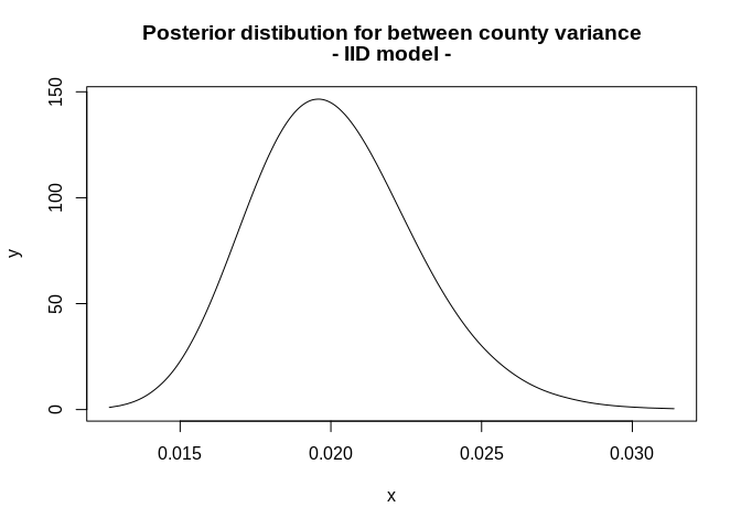
final.dat$fitted_m2<-mod2$summary.fitted.values$mean

p1<-final.dat%>%
  filter(year%in%c(2000))%>%
  mutate(qrr=cut(fitted_m2, breaks = quantile(final.dat$fitted_m2, p=seq(0,1,length.out = 6)), include.lowest = T))%>%
  ggplot()+geom_sf(aes(fill=qrr))+scale_colour_brewer(palette = "RdBu" )+scale_fill_brewer(palette = "RdBu", na.value="grey")+guides(fill=guide_legend(title="Relative Risk Quartile"))+ggtitle(label="Relative Risk Quartile - IID Model, 2000")+coord_sf(crs = 7603)

p2<-final.dat%>%
  filter(year%in%c(2007))%>%
  mutate(qrr=cut(fitted_m2, breaks = quantile(final.dat$fitted_m2, p=seq(0,1,length.out = 6)), include.lowest = T))%>%
  ggplot()+geom_sf(aes(fill=qrr))+scale_colour_brewer(palette = "RdBu" )+scale_fill_brewer(palette = "RdBu", na.value="grey")+guides(fill=guide_legend(title="Relative Risk Quartile"))+ggtitle(label="Relative Risk Quartile - IID Model, 2007")+coord_sf(crs = 7603)

library(gridExtra)
##
## Attaching package: 'gridExtra'## The following object is masked from 'package:dplyr':
##
## combine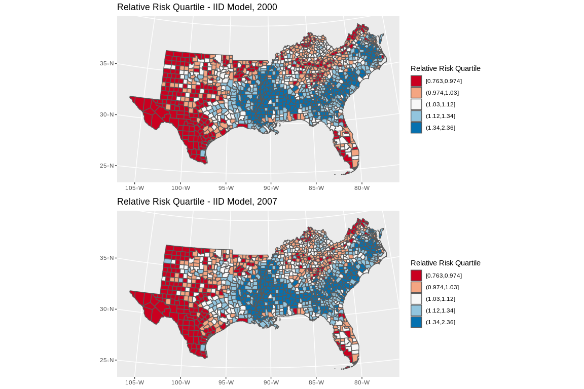
## TableGrob (2 x 1) "arrange": 2 grobs
##   z     cells    name           grob
## 1 1 (1-1,1-1) arrange gtable[layout]
## 2 2 (2-2,1-1) arrange gtable[layout]BYM Model
Model with spatial correlation - Besag, York, and Mollie (1991) model and temporal heterogeneity \[\text{Deaths}_{ij} \sim NB(\mu_{ij}, \gamma)\] \[\mu_{ij} = \text{log(E_d)}_{ij} + X' \beta + u_j + v_j + \gamma_t\]
Which has two random effects, one an IID random effect and the second a spatially correlated random effect, specified as a conditionally auto-regressive prior for the \(v_j\)’s. This is the Besag model:
\[v_j|v_{\neq j},\sim\text{Normal}(\frac{1}{n_i}\sum_{i\sim j}v_j,\frac{1}{n_i\tau})\] and \(u_j\) is an IID normal random effect, \(\gamma_t\) is also given an IID Normal random effect specification, and there are now three hyperparameters, \(\tau_u\) and \(\tau_v\) and \(\tau_{\gamma}\) and each are given log-gamma priors.
For the BYM model we must specify the spatial connectivity matrix in the random effect.
#final.dat$year_c<-final.dat$year - 2004
f3<-rate~scale(pblack)+scale(phisp)+scale(ppov)+
  f(struct, model = "bym", constr = T, scale.model = T, graph = H,param=c(1,.5))+
  f(year, model="iid",param=c(1,.5)) #temporal random effect

mod3<-inla(formula = f3,data = final.dat,
           family = "nbinomial", E = E_d,
           control.compute = list(waic=T),
           num.threads = 2,
               verbose = F,
           control.predictor = list(link=1))

#total model summary
summary(mod3)
##
## Call:
## c("inla(formula = f3, family = \"nbinomial\", data = final.dat, E =
## E_d, ", " verbose = F, control.compute = list(waic = T),
## control.predictor = list(link = 1), ", " num.threads = 2)")
## Time used:
## Pre = 0.737, Running = 138, Post = 1.26, Total = 140
## Fixed effects:
## mean sd 0.025quant 0.5quant 0.975quant mode kld
## (Intercept) 0.115 0.129 -0.145 0.115 0.374 0.115 0
## scale(pblack) 0.157 0.016 0.126 0.158 0.189 0.158 0
## scale(phisp) -0.039 0.016 -0.069 -0.039 -0.007 -0.040 0
## scale(ppov) 0.043 0.016 0.012 0.043 0.075 0.043 0
##
## Random effects:
## Name Model
## struct BYM model
## year IID model
##
## Model hyperparameters:
## mean sd
## size for the nbinomial observations (1/overdispersion) 0.627 0.009
## Precision for struct (iid component) 51.094 7.099
## Precision for struct (spatial component) 1974.289 1903.577
## Precision for year 8.760 4.130
## 0.025quant 0.5quant
## size for the nbinomial observations (1/overdispersion) 0.609 0.627
## Precision for struct (iid component) 38.602 50.591
## Precision for struct (spatial component) 174.447 1425.658
## Precision for year 2.885 8.075
## 0.975quant mode
## size for the nbinomial observations (1/overdispersion) 0.644 0.628
## Precision for struct (iid component) 66.447 49.595
## Precision for struct (spatial component) 7055.730 496.592
## Precision for year 18.742 6.583
##
## Expected number of effective parameters(stdev): 133.75(15.30)
## Number of equivalent replicates : 80.09
##
## Watanabe-Akaike information criterion (WAIC) ...: 114605.76
## Effective number of parameters .................: 69.81
##
## Marginal log-Likelihood: -56934.15
## Posterior marginals for the linear predictor and
## the fitted values are computed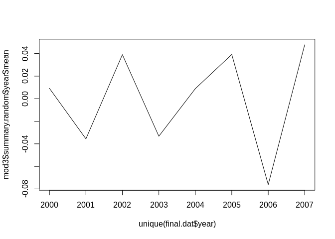
m3a<- inla.tmarginal(
        function(x) (1/x),
        mod3$marginals.hyperpar$`Precision for struct (iid component)`)
m3b<- inla.tmarginal(
        function(x) (1/x),
        mod3$marginals.hyperpar$`Precision for struct (spatial component)`)
m3c<- inla.tmarginal(
        function(x) (1/x),
        mod3$marginals.hyperpar$`Precision for year`)

plot(m3a, type="l", main=c("Posterior distibution for between county variance", "- BYM model -"), xlim=c(0, .2), ylim=c(0, 300))
lines(m3b, col="red")
lines(m3c, col="green")
legend("topright", legend=c("BYM IID", "BYM Spatial", "Year"), col=c(1, "red", "green"), lty=c(1,1,1))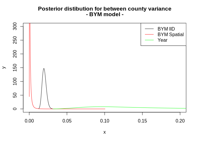
##                   low       high
## level:0.95 0.01475866 0.02544088## low high
## level:0.95 0.00005416961 0.003970123## low high
## level:0.95 0.03927999 0.2945931This indicates very low spatially correlated variance in these data.
Space-time mapping of the fitted values
final.dat$fitted_m3<-mod3$summary.fitted.values$mean

p3<-final.dat%>%
  filter(year%in%c(2000))%>%
  mutate(qrr=cut(fitted_m3, breaks = quantile(final.dat$fitted_m3, p=seq(0,1,length.out = 6)), include.lowest = T))%>%
  ggplot()+geom_sf(aes(fill=qrr))+scale_colour_brewer(palette = "RdBu" )+scale_fill_brewer(palette = "RdBu", na.value="grey")+guides(fill=guide_legend(title="Relative Risk Quartile"))+ggtitle(label="Relative Risk Quartile - IID Model, 2000")+coord_sf(crs = 7603)

p4<-final.dat%>%
  filter(year%in%c(2007))%>%
  mutate(qrr=cut(fitted_m3, breaks = quantile(final.dat$fitted_m3, p=seq(0,1,length.out = 6)), include.lowest = T))%>%
  ggplot()+geom_sf(aes(fill=qrr))+scale_colour_brewer(palette = "RdBu" )+scale_fill_brewer(palette = "RdBu", na.value="grey")+guides(fill=guide_legend(title="Relative Risk Quartile"))+ggtitle(label="Relative Risk Quartile - IID Model, 2007")+coord_sf(crs = 7603)

pall2<-grid.arrange(p3, p4, nrow=2)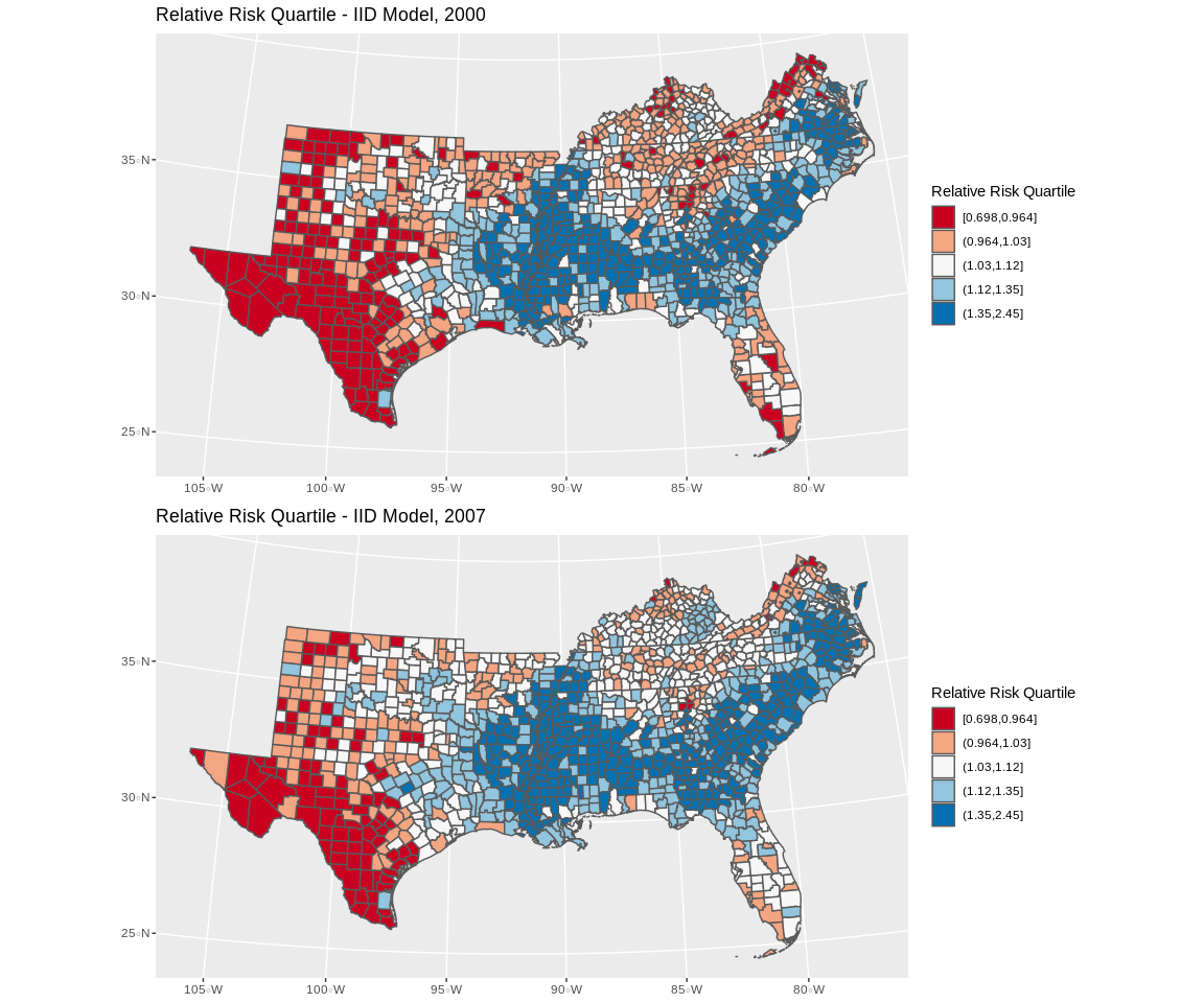
## TableGrob (2 x 1) "arrange": 2 grobs
##   z     cells    name           grob
## 1 1 (1-1,1-1) arrange gtable[layout]
## 2 2 (2-2,1-1) arrange gtable[layout]Map of spatial random effects
It is common to map the random effects from the BYM model to look for spatial trends, in this case, there are not strong spatial signals:
us_co$sp_re<-mod3$summary.random$struct$mean[1:length(unique(final.dat$cofips))]
us_co%>%
  mutate(qse=cut(sp_re, breaks = quantile(sp_re, p=seq(0,1,length.out = 6)), include.lowest = T))%>%
  ggplot()+geom_sf(aes(fill=qse))+scale_colour_brewer(palette = "RdBu" )+scale_fill_brewer(palette = "RdBu", na.value="grey")+guides(fill=guide_legend(title="Spatial Excess Risk"))+ggtitle(label="Spatial Random Effect - BYM Model")+coord_sf(crs = 7603)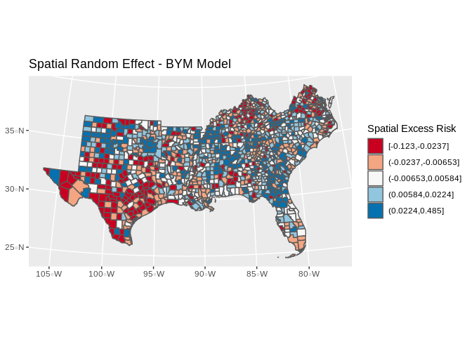
Exceedence probabilities
In Bayesian spatial models that are centered on an epidemiological type of outcome, it is common to examine the data for spatial clustering. One way to do this is to examine the clustering in the relative risk from one of these GLMM models. For instance if \(\theta\) is the relative risk \[\theta = exp(\beta_0 + \beta_1*x_1 + u_j)\] from one of our Negative binomial models above. We can use the posterior marginals of the relative risk to ask \(\theta \gt \theta^*\) where \(\theta^*\) is a specific level of excess risk, say 50% extra or \(\theta > 1.25\). If the density, or \(\text{Pr}(\theta \gt \theta^*)\) is high, then there is evidence that the excess risk is not only high, but significantly high.
To get the exceedence probabilities from one of our models, we can use the inla.pmarginal() function to ask if \(\text{Pr}(\theta \gt \theta^*)\)
thetastar<-1.25#theta*
inlaprob<- unlist(lapply(mod3$marginals.fitted.values, function(X){
   1-inla.pmarginal(thetastar, X)
}))
hist(inlaprob)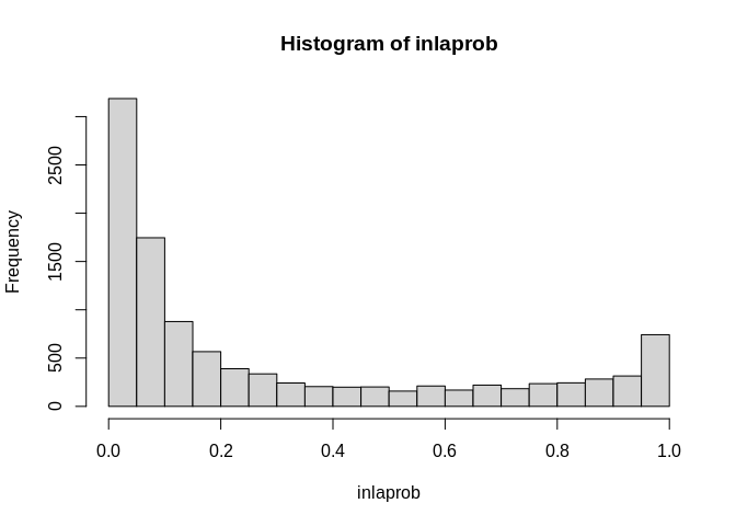
So, we see lots of occasions where the exceedence probability is greater than .9. We can visualize these in a map.
final.dat$exceedprob<-inlaprob

final.dat%>%
  filter(year%in%c(2007))%>%
  mutate(qrr=cut(exceedprob, breaks = c(0, .5, .9, .95, .99, 1), include.lowest = T))%>%
  ggplot()+geom_sf(aes(fill=qrr))+scale_colour_brewer(palette = "Blues" )+scale_fill_brewer(palette = "Blues", na.value="grey")+guides(fill=guide_legend(title=""))+ggtitle(label=expression(paste("Exceedence Probability Relative Risk ","Pr( ",theta," >1.25"," )  - 2007") ))+coord_sf(crs = 7603)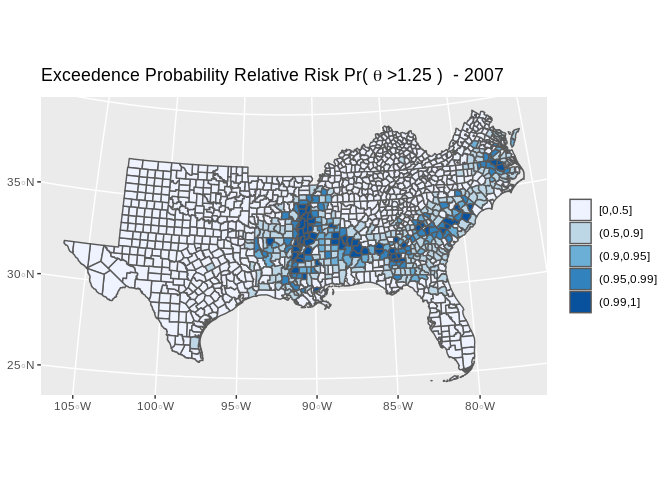
#library(mapview)

#map1<-final.dat%>%
 # filter(year%in%c(2007))%>%
#  mutate(qrr=cut(exceedprob, breaks = c(0, .5, .9, .95, .99, 1), include.lowest = T))

#clrs <- colorRampPalette(brewer.pal(6, "Blues"))
#mapView(as(map1, "Spatial"), zcol="qrr", legend=T, col.regions=clrs, map.types="OpenStreetMap")
Which shows several areas of the south where risk the infant mortality rate is signficantly higher than the national rate, with high posterior probability.
References
Besag, J., York, J., & Mollie, a. (1991). Bayesian image-restoration, with 2 applications in spatial statistics. Annals of the Institute of Statistical Mathematics, 43(1), 1-20. https://doi.org/10.1007/BF00116466